The majority of the following projects were carried out as a part of one of these Coursera specialisations:
- Data Science: Foundations using R (Johns Hopkins University)
- Data Science (Johns Hopkins University)
- Genomic Data Science (Johns Hopkins University)
- Google Data Analytics Professional Certificate
 Shiny App: COVID-19 vaccination across countries

- Web App with up-to-date data
- App presentation
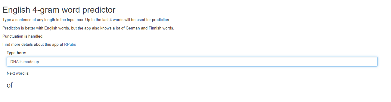
NLP: Shiny App for English word prediction
The prediction model was built using a Corpora. Here you can find:
- The Web App
- An App presentation

Interactive COVID Vaccine World Map with Leaflet
The map shows data available at 5/4/2021. R code to generate up-to-date maps is provided at the same link.

Analysis of european population from 1965 to 2019
Data are from the WHO mortality database. Here you can find:
- A Webpage with details about data and R code used to clean them
- A summary Pivot table in Google Sheets
- A Google Slides presentation of my findings
- A Video of me presenting my findings
With the following dashboard, built in Tableau, you can directly explore the data:
Genomic data science project: Re-analysis of fetal and adult brain raw RNA-seq data
Data are from the study “Developmental regulation of human cortex transcription and its clinical relevance at base resolution” (Jaffe et al, 2015 Jan PMID:25501035). Here you can find documentation for the various steps of the analysis:

Exploratory analysis in R of NOAA Storm Data (1996-2010)
Read on RPubs my analysis focusing on population health and economic impact of events

Analysis of the exponential distribution in R
Read this PDF file with details about the simulation experiment and the application of the Central Limit Theorem

Analysis of the ToothGrowth R dataset
Read this PDF file about exploratory analysis and hyphotesis testing on the dataset

Machine Learning project: human activity recognition
Human activity recognition on Weight Lifting Exercices Dataset: Webpage

Plotly chart about World Happiness Report 2021
R markdown Presentation with interactive plot

Example of data cleaning
I used raw data collected from Samsung Galaxy S smartphone’s accelerometers to generate tidy training and test datasets
GitHub repo with R code
R Plots

- Simple plots using data in the “Individual household electric power consumption Data Set” from UC Irvine Machine Learning Repository
GitHub repo- More advanced plots about Fine Particulate levels in the US
GitHub repo- Exploratory plots on Samsung Galaxy S smartphone’s accelometers data
GitHub repo
The transmission type effect on Miles per gallon
Read this PDF file with an analysis of the mtcars R dataset